
Soft Power, Su Richardson exhibition, Wolverhampton Art Gallery, Sept 2023
Exhibition visual identity concept and graphic design, commissioning artist / crochet and surface designer Lucy Mason
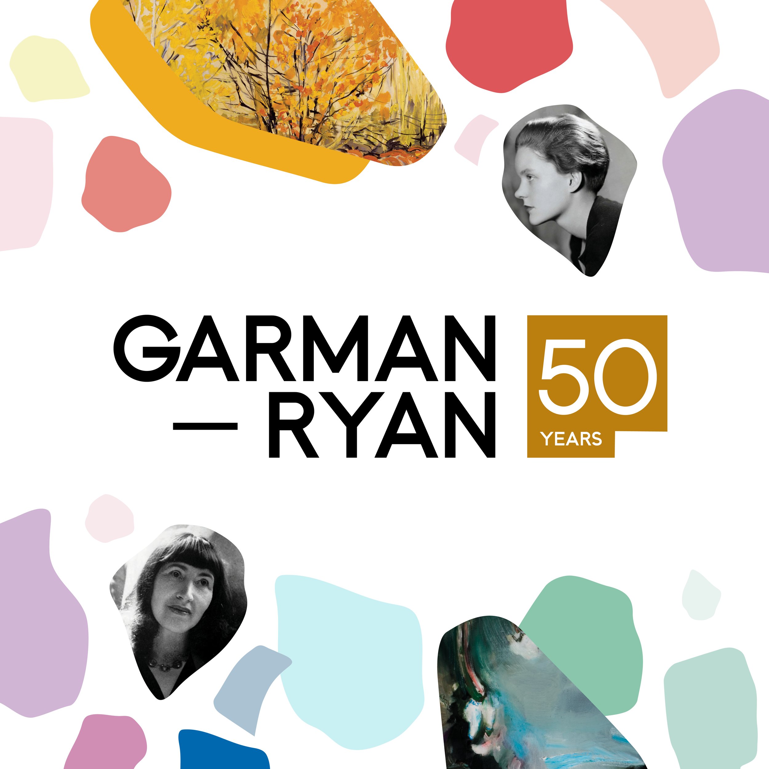
Garman—Ryan: 50 Years, New Art Gallery Walsall, June 2023
Exhibition design and visual identity with publication

Birmingham’s Neighbourhood Planning Toolkit (Project manager; website & content design, on behalf of BCM & Locality for Birmingham City Council, funded by Dept. Levelling Up, Housing and Communities) May 2023

New Art Gallery Walsall, July 2023
The gallery’s Collections Community Panel’s 2023-24 temporary exhibition ‘The Class Act’ welcoming space exploring class, pride and privilege.
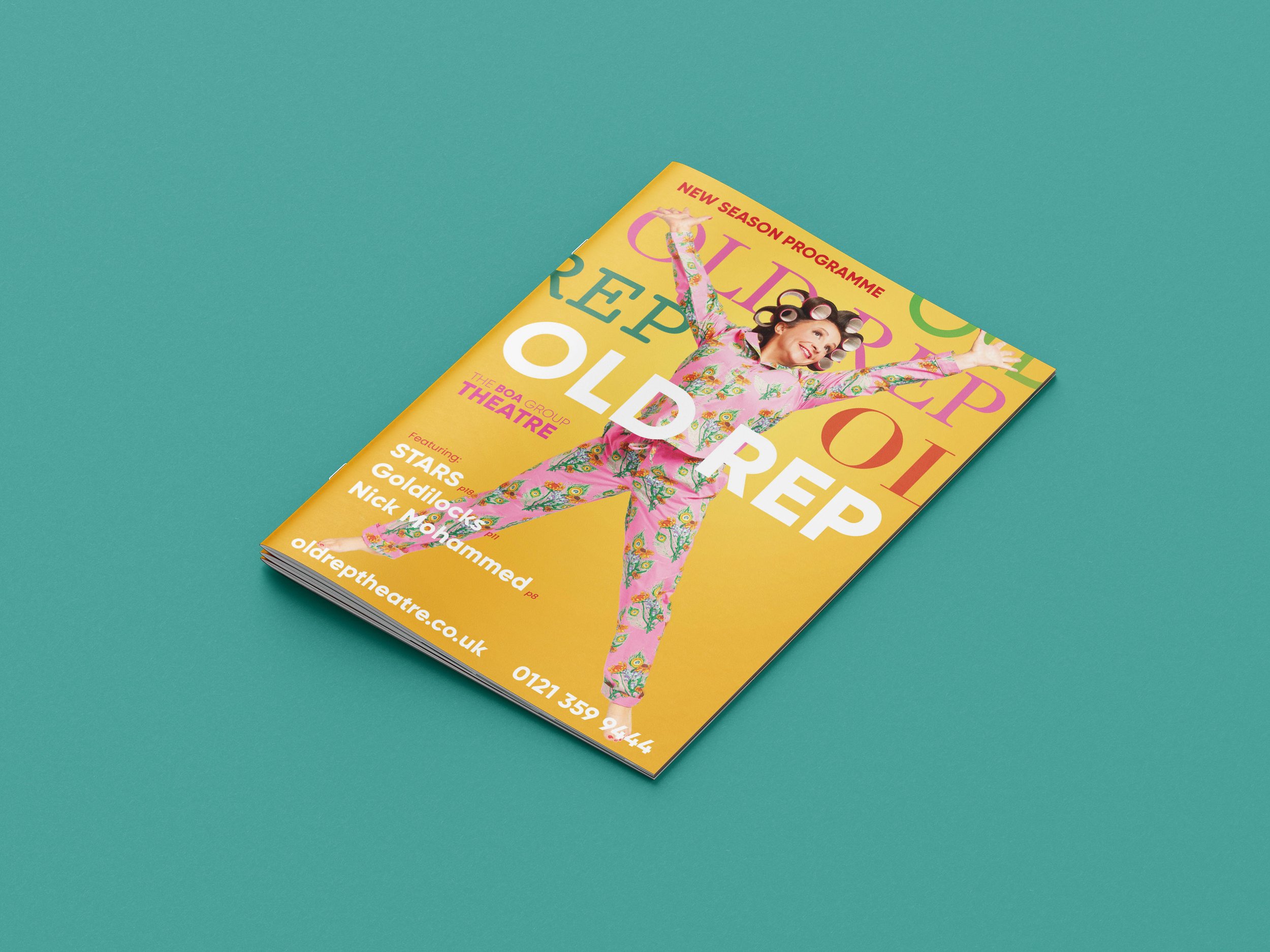
Overhaul of The Old Rep’s seasonal brochure, with a brand refresh throughout

Here&Queer, The New Art Gallery Walsall June 2022
Exhibition design and visual identity, with publication

Unlocking Hidden Stories, Canal and River Trust, April 2022
Visual identity and interpretation for moveable objects case